Blog #204 5/2/17
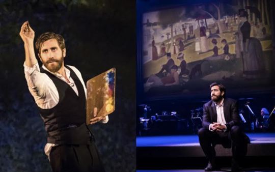
Jake Gyllenhaal as Georges Seurat
Recently, Beverly and I went to the Hudson Theater, on West 44th Street, New York City, to see Jake Gyllenhaal in the beautiful Stephen Sondheim/James Lapine musical “Sunday in the Park with George.” The production, music, performances, and staging were so moving that we stood with the rest of the audience for a long, well-deserved ovation when the play ended.
Frankly, for me, Sondheim’s songs/music for a long time seemed too intellectual. You don’t leave humming the tunes, you can’t tap your foot to the music, let alone dance with any fervor. But if you give it a chance, Sondheim’s brilliant work can yield the kind of emotion we felt that evening at the Hudson Theatre.
My good friend, Ron Ramin, a great American composer has said of Sondheim:
“Stephen Sondheim is one of American’s great natural resources. He transformed America’s Musical Theater in much the same way that Stravinsky revolutionized concert music.”
The musical’s story follows the post-impressionist French painter Georges-Pierre Seurat (1859-1891) in the many months he spent working on his most famous painting, “A Sunday Afternoon on the Island of La Grande Jatte,” (painted from 1884 to 1886).
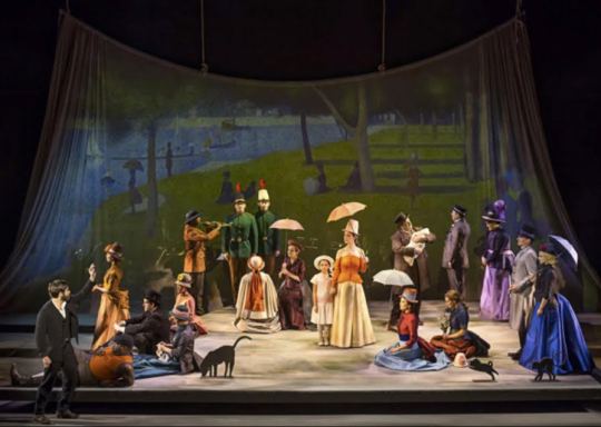
The cast, blocked to depict the famous painting. Gyllenhaal, lower left, as the artist
Seeing this play was a kind of re-visit for me, in a number of ways.
The painting, ten feet wide, resides in Chicago’s world-renowned Art Institute. Having spent the first 25 years of my life as a Chicagoan, I have seen and studied this painting in the museum many dozens of times.
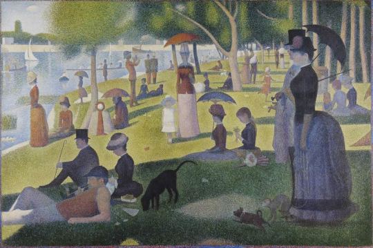
Georges Seurat: A Sunday Afternoon on the Island of La Grande Jatte, 1884-1886
I thought I knew the painting well, but until seeing the performance I’d never realized that the dark green column at the top left corner is the Eiffel Tower on the Champ de Mars in Paris during the early stages of construction as the entrance to the 1889 World’s Fair.
My connection to the painting continued when, in 1985, I saw the first production of the Sondheim musical in New York City, with Mandy Patinkin (currently playing a CIA spook in “Homeland”) and Bernadette Peters.
And finally I used the painting for a fashion shoot for Blackbook Magazine entitled “Masters of Art, Masters of Fashion.” The Art Institute loaned me a fine chrome of the work to scan for my shoot. The fashions were from Comme des Garcons, by the incredibly creative fashion designer Rei Kawakubo.
The magazine’s designer cropped the image to fit the magazine’s format. It happens often that a painting or photograph is cropped in reproduction, and it’s nothing less than a sin. Art directors and magazine designers often crop my photographs in order to make them “fit” their designs — it’s as if they haven’t considered the fact that I have already spent a great deal of effort deciding on the picture’s framing. And that framing is an artist’s opinion, an important, personal opinion, in this case Seurat’s. And so the magazine’s designer did just that, cropping the sides to fit the page, as Seurat rolls over in his grave.
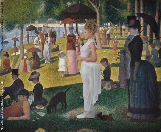
My rendering of the image as it appeared in the magazine.
My challenge was to blend my models into Seurat’s light.
The rule is an axiom in art: “Where there is light, there is shadow.” Therefore the shadows define the light, and have to make sense.
Note that I placed the model in front, slightly right of center, in the shadow that occupies the bottom third of the painting. I lit her with a giant, diffused “shadowless” light, cheating a little to make her a little lighter than she might have been in order to show off the fashions…this was a fashion story after all.
The two girls near the upper left (the same model in the same clothes) needed to stand in Seurat’s direct sunlight; I used a light to mimic the sun (that “tiny” light 93 million miles away). In the studio this was done using the smallest light available, placed as far away as possible. Note the distinct “hard” shadows that are formed from “sunlight” as well my studio light.
Also of note: The angles of the well-defined, “hard” shadows formed by the sun are a bit inconsistent throughout the image. In some cases they are horizontal and others oblique. This has to do with the fact that Seurat painted throughout the day, as the sun moved and therefore moved its shadows. He painted the shadows as he saw them rather than adhering to a constant angle.
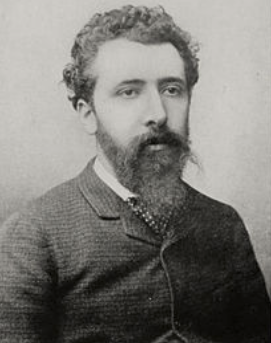
Georges Seurat
For those interested in Seurat’s techniques:
Using the science of color Seurat produced original work that art historians have written depicted form and color more subtly and effectively than anything known before.
How did this come about?
The scientist-writer Michel Eugène Chevreul and others discovered that two colors juxtaposed, very close together or even slightly overlapping, would have the effect of another color when seen from a distance. The discovery of this phenomenon became the basis for such Neoimpressionists as Seurat. The “harmony” of the subtle colors Chevreul described is what Seurat called “emotion.”
Pointillism is the technique of painting in which small, distinct dots of color form an image. The dots allow the viewer’s eye to blend colors optically, rather than having the colors physically blended on the canvas; this is known as chromoluminarism, or divisionism.
Seurat took to heart the color theorists’ notion of a scientific approach to painting. He utilized color to create what he felt was harmony and emotion in much the same way a musician uses counterpoint and variation to create harmony in music. He theorized that the scientific application of color was like any other natural law, and he was driven to prove this conjecture. He thought that the knowledge of perception and optical laws could be used to create a new language of art.
In ”A Sunday Afternoon on the Island of La Grande Jatte,” he used pointillism and chromoluminarism to accomplish this. Seurat felt that these techniques produced the maximum luminosity scientifically possible.
The obsessive desire of Seurat to use science made him almost oblivious to the opinions of others. With this in mind, Sondheim and Lapine wrote one of the great lines from the play and set it to music:
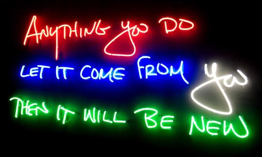
Beverly and I at first thought the last word was “true.” I think “true”
actually is better than “new.” If it is true, it will probably be new as well.
I live by that statement. I cannot see someone’s creative idea and then copy it. Oh, I could, I suppose, but I’d have to hide it from the world. The way to be true in art is to dig down inside to find the countless little “beings” churning about, dying to get out. Get in touch with what you’re made of inside, and let something entirely you, new and true emerge.
Glitterati Incorporated, the publisher of the Retrospective, Schatz Images: 25 Years is now offering the two- book boxed set at a discount from the original price. The set comes with an 11″x14” print of the buyer’s choice.
http://schatzimages25years-glitterati.com